Letterforms grown from a two-body attractor, traced as bezier paths.
Anders Hoff's
Spline Script
reaches writing like this through spline geometry. The strokes here are not drawn at all:
two charges are let go, and the path each one falls into is the letter.
By Anna Shishlyakova on
Black and white
The same seed drawn as light on dark and dark on light. Drag to compare.
Attractor sandbox
Move the two charges and their initial velocities to shape a single stroke.
Horizontal and vertical
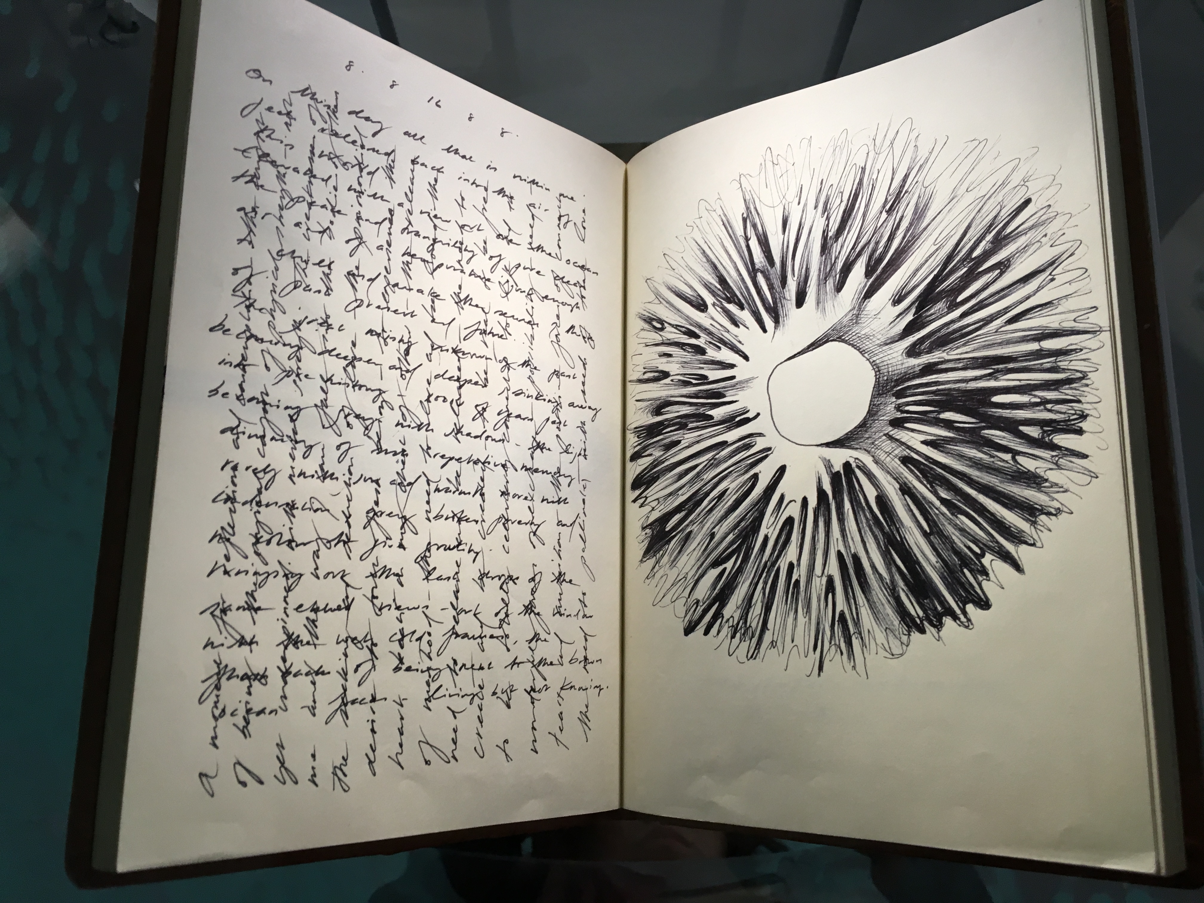
Grid-placed strokesInspired by Ross Lovegrove's sketchbook
The alphabet
All thirty-three letters, upper and lower case, each fitted to its own cell. Ъ,
Ы and Ь have no stroke of their own.
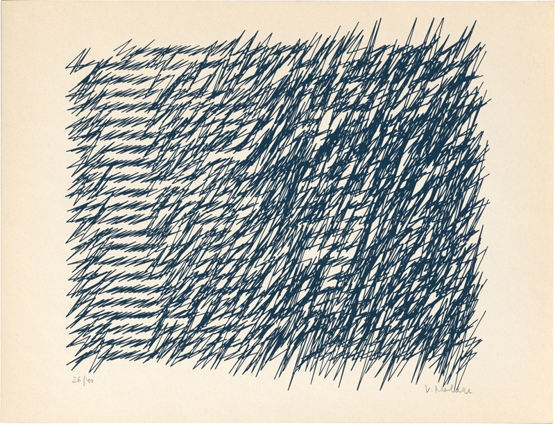
Inspired by Vera Molnár's Lettres de ma mère, where her mother's handwriting is wound tighter and tighter until it stops being
readable and starts being a texture.
Strokes without letters
The same two charges with nothing fitted to a baseline: every stroke is laid down where
it falls, until the page is a texture rather than writing. G is how hard the charges
pull on each other, and the minimum distance is how close they may get before the pull
stops growing.
The print
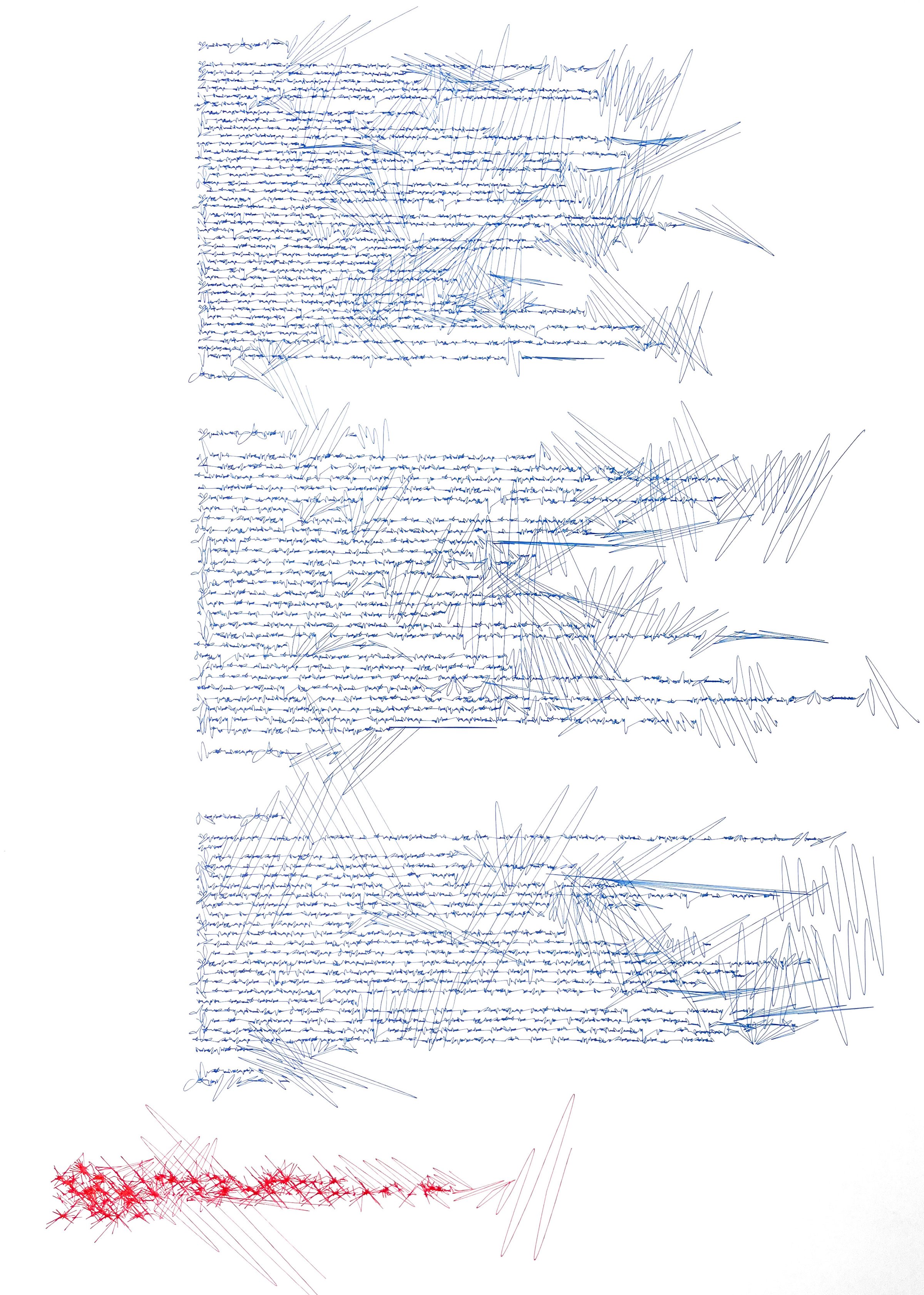
Asemic letters, the finished piece these sketches were made for.